

Détour
Turning everyday routes into opportunities to explore the city
year
year
2026
2026
timeframe
timeframe
2 months
2 months
context
context
Academic
Academic
tools
Figjam, Figma, Canva
Figjam, Figma, Canva
contributors
contributors
Group of 4
Group of 4

year
2026
timeframe
2 months
context
Academic
tools
Figjam, Figma, Canva
contributors
Group of 4
00
Intro & Context
This project began with a broad academic design prompt: transportation challenges in Montreal. Working in a team of four over two months, we were not permitted to conduct direct interviews or recruit participants for primary research, which pushed us toward secondary research, lived experience, and community sources to ground our decisions. The project was completed as part of a UX design course at McGill University in 2026.
Problem Newcomers to Montreal rely on navigation tools that prioritize speed over experience, making it easy to get somewhere but nearly impossible to discover the parks, murals, markets, and vibrant streets that make a city feel like home.
Solution Détour reimagines everyday navigation as an opportunity for discovery. Community-recommended stops, scenic routes, and qualitative tags like calm or lively surface along paths people are already taking, turning a commute into a reason to look up.
00
Intro & Context
This project began with a broad academic design prompt: transportation challenges in Montreal. Working in a team of four over two months, we were not permitted to conduct direct interviews or recruit participants for primary research, which pushed us toward secondary research, lived experience, and community sources to ground our decisions. The project was completed as part of a UX design course at McGill University in 2026.
Problem Newcomers to Montreal rely on navigation tools that prioritize speed over experience, making it easy to get somewhere but nearly impossible to discover the parks, murals, markets, and vibrant streets that make a city feel like home.
Solution Détour reimagines everyday navigation as an opportunity for discovery. Community-recommended stops, scenic routes, and qualitative tags like calm or lively surface along paths people are already taking, turning a commute into a reason to look up.
01
The Problem
The starting prompt was transportation challenges in Montreal. We could have gone in any number of directions. What pulled us toward exploration was something more personal than a research finding. We had all experienced it ourselves, and we kept hearing it from people around us.
Newcomers to Montreal navigate the city in a particular way. They follow the direct route. They use Google Maps to get from A to B and return home. Not because they are incurious, but because the alternatives are not visible. The parks, the murals, the Saturday markets, the staircases with views: these things exist and are documented somewhere online, but they are scattered across platforms, buried in Reddit threads, and almost always dependent on knowing someone who has been here long enough to know.
The deeper issue is not access to information. It is that existing navigation tools are built entirely around efficiency. They optimize for speed, not for the experience of being somewhere new. Discovery platforms, the ones that do focus on local knowledge, exist completely separately from navigation. That separation means users have to plan outings in advance rather than stumble into something good mid-walk. Exploration becomes a deliberate project instead of something that happens naturally.
We noticed a specific opportunity hiding in that gap. What if discovery could happen during travel that was already happening? What if the route itself became the experience?

01
The Problem
The starting prompt was transportation challenges in Montreal. We could have gone in any number of directions. What pulled us toward exploration was something more personal than a research finding. We had all experienced it ourselves, and we kept hearing it from people around us.
Newcomers to Montreal navigate the city in a particular way. They follow the direct route. They use Google Maps to get from A to B and return home. Not because they are incurious, but because the alternatives are not visible. The parks, the murals, the Saturday markets, the staircases with views — these things exist and are documented somewhere online, but they are scattered across platforms, buried in Reddit threads, and almost always dependent on knowing someone who has been here long enough to know.
The deeper issue is not access to information. It is that existing navigation tools are built entirely around efficiency. They optimize for speed, not for the experience of being somewhere new. Discovery platforms, the ones that do focus on local knowledge, exist completely separately from navigation. That separation means users have to plan outings in advance rather than stumble into something good mid-walk. Exploration becomes a deliberate project instead of something that happens naturally.
We noticed a specific opportunity hiding in that gap. What if discovery could happen during travel that was already happening? What if the route itself became the experience?
01
The deeper issue is not access to information. It is that existing navigation tools are built entirely around efficiency. They optimize for speed, not for the experience of being somewhere new. Discovery platforms, the ones that do focus on local knowledge, exist completely separately from navigation. That separation means users have to plan outings in advance rather than stumble into something good mid-walk. Exploration becomes a deliberate project instead of something that happens naturally.
We noticed a specific opportunity hiding in that gap. What if discovery could happen during travel that was already happening? What if the route itself became the experience?
The Problem
The starting prompt was transportation challenges in Montreal. We could have gone in any number of directions. What pulled us toward exploration was something more personal than a research finding. We had all experienced it ourselves, and we kept hearing it from people around us.
Newcomers to Montreal navigate the city in a particular way. They follow the direct route. They use Google Maps to get from A to B and return home. Not because they are incurious, but because the alternatives are not visible. The parks, the murals, the Saturday markets, the staircases with views — these things exist and are documented somewhere online, but they are scattered across platforms, buried in Reddit threads, and almost always dependent on knowing someone who has been here long enough to know.
02
Research & Discovery
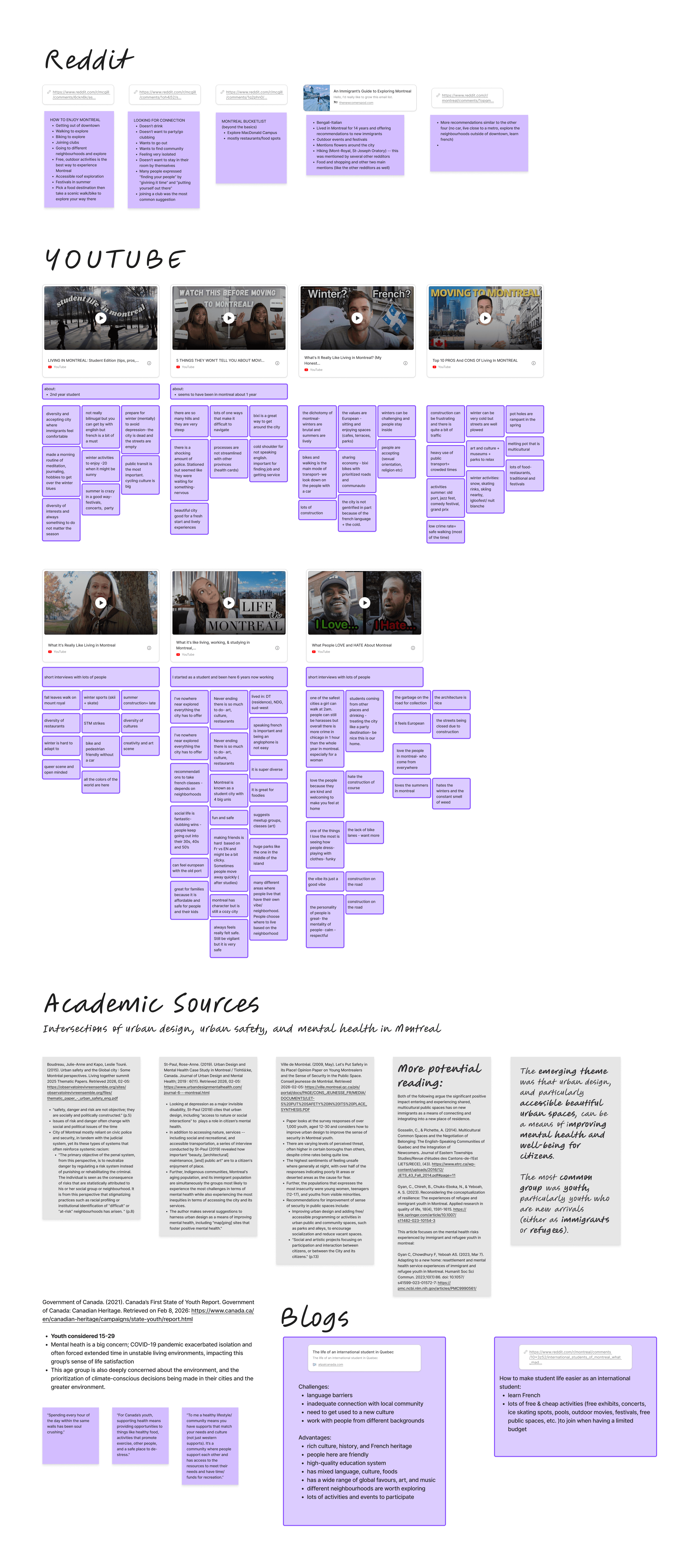
After observing some key issues with newcomers as students in Montreal, we built our understanding from secondary research and lived experience: academic literature on urban design and safety, government reports on youth well-being, YouTube videos of Montrealers discussing life in the city, Reddit threads where newcomers ask for advice, and blogs documenting the experience of arriving somewhere new for the first time.
About the users
Urban design shapes whether people feel safe enough to explore
Research shows that feelings of safety in cities are influenced less by actual crime rates than by how familiar and legible a space feels. Poorly lit streets, unfamiliar intersections, and areas without visible foot traffic create hesitation, especially at night, and especially for people who have not yet built a mental map of their surroundings. Environments that are active, well maintained, and visually interesting do the opposite. They invite people to slow down, linger, and venture further. For newcomers especially, discovering these kinds of spaces can support social integration and reduce the isolation that often comes with arriving somewhere new.
Young adults arriving without social networks are at risk of missing the city entirely
Montreal attracts a large number of international students and immigrants each year. Research on youth well-being consistently shows that access to recreational spaces, cultural activities, and community environments supports mental health and helps people build a sense of belonging in a new place. But finding those spaces, and feeling confident enough to go, depends on a familiarity that newcomers do not yet have. Without it, even a free afternoon can feel directionless.
Local knowledge lives in informal networks, not platforms
Across every source we analyzed, the same pattern appeared. Montreal is widely described as vibrant, welcoming, and full of hidden character. Walking and cycling are consistently named as the best ways to experience it. And yet the places worth finding are almost always discovered through personal recommendations from friends or long-time residents. For newcomers without those connections, that knowledge simply does not transfer. The city stays opaque longer than it needs to.
Competitive analysis
Competitive analysis
Where existing tools fall short
We mapped existing tools across three categories: route and activity tracking, safety and reporting, and local discovery. Each category revealed something useful and each revealed the same fundamental gap. The tools that help you get somewhere do not help you discover anything along the way. The tools that surface local knowledge do not connect to navigation. And the tools built around safety tend to make the city feel more threatening rather than more inviting. No single product addressed all three, and none of them were designed for someone who simply wants to wander with confidence.
Route and activity tracking apps
Route and activity tracking apps like Strava, AllTrails, MapMyRun, and Go Jauntly offer route visualization, distance tracking, and looped paths with estimated completion times. But these apps are built for performance. The routes are optimized for exercise, not for the experience of moving through a neighborhood. Cultural landmarks, public art, and the texture of a neighborhood are outside their scope entirely.


Safety and Reporting
The safety and reporting category was more nuanced than we expected.
SafeTTC allows users to report incidents but does not surface that information back to the community.
Citizen shares incident reports actively but the interface is built entirely around threat, making the city feel more dangerous rather than more navigable.
Waze handles this more thoughtfully, filtering hazards so only those relevant to your current route appear.
Uber's approach to personal safety was the most instructive: allowing users to share their live location or audio record a trip works with the user's confidence rather than against it.
Local discovery platforms
Local discovery platforms were the category closest to what we were trying to build.
Google Maps is the most efficient navigation tool available but is heavily business-focused and designed for getting somewhere, not wandering.
Spotted by Locals offers genuine community curation but sits behind a paid subscription, creating a barrier for students and newcomers most likely to benefit.
Street Art Cities maps only murals. Similar niche platforms exist for other categories, each taking you to one destination at a time before handing you off to Google Maps to actually get there.
Discovery and navigation never meet. That friction is just high enough to make spontaneous exploration impractical.


Exploration and access to public spaces support mental well-being. For newcomers especially, discovering green spaces, cultural venues, and active streets is one of the fastest paths to feeling at home in a new city.
Exploration and access to public spaces support mental well-being. For newcomers especially, discovering green spaces, cultural venues, and active streets is one of the fastest paths to feeling at home in a new city.
Key Insights
To keep in mind going forward…
Feelings of safety are shaped by familiarity, not just by actual risk. Active, well-lit, visually interesting environments invite people further. Unfamiliar spaces create hesitation that no notification or alert can resolve.
Feelings of safety are shaped by familiarity, not just by actual risk. Active, well-lit, visually interesting environments invite people further. Unfamiliar spaces create hesitation that no notification or alert can resolve.
Young adults arriving without social networks are at risk of missing the city entirely. Without existing connections to draw on, discovering what Montreal has to offer takes far longer than it should, and isolation sets in quickly.
Young adults arriving without social networks are at risk of missing the city entirely. Without existing connections to draw on, discovering what Montreal has to offer takes far longer than it should, and isolation sets in quickly.
Local knowledge lives in informal networks and does not transfer on its own. What long-time residents know about the city stays invisible to newcomers unless there is a platform designed to move it.
Local knowledge lives in informal networks and does not transfer on its own. What long-time residents know about the city stays invisible to newcomers unless there is a platform designed to move it.
No existing tool bridges navigation and discovery. Every product in the competitive landscape chose one or the other, and moving between them creates just enough friction to make spontaneous exploration impractical.
No existing tool bridges navigation and discovery. Every product in the competitive landscape chose one or the other, and moving between them creates just enough friction to make spontaneous exploration impractical.
Key Insights
To keep in mind going forward…
02
Research & Discovery
After observing some key issues with newcomers as students in Montreal, we built our understanding from secondary research and lived experience: academic literature on urban design and safety, government reports on youth well-being, YouTube videos of Montrealers discussing life in the city, Reddit threads where newcomers ask for advice, and blogs documenting the experience of arriving somewhere new for the first time.
About the users
Urban design shapes whether people feel safe enough to explore
Research shows that feelings of safety in cities are influenced less by actual crime rates than by how familiar and legible a space feels. Poorly lit streets, unfamiliar intersections, and areas without visible foot traffic create hesitation, especially at night, and especially for people who have not yet built a mental map of their surroundings. Environments that are active, well maintained, and visually interesting do the opposite. They invite people to slow down, linger, and venture further. For newcomers especially, discovering these kinds of spaces can support social integration and reduce the isolation that often comes with arriving somewhere new.

Young adults arriving without social networks are at risk of missing the city entirely
Montreal attracts a large number of international students and immigrants each year. Research on youth well-being consistently shows that access to recreational spaces, cultural activities, and community environments supports mental health and helps people build a sense of belonging in a new place. But finding those spaces, and feeling confident enough to go, depends on a familiarity that newcomers do not yet have. Without it, even a free afternoon can feel directionless.
Local knowledge lives in informal networks, not platforms
Across every source we analyzed, the same pattern appeared. Montreal is widely described as vibrant, welcoming, and full of hidden character. Walking and cycling are consistently named as the best ways to experience it. And yet the places worth finding are almost always discovered through personal recommendations from friends or long-time residents. For newcomers without those connections, that knowledge simply does not transfer. The city stays opaque longer than it needs to.
Competitive analysis
Where existing tools fall short
We mapped existing tools across three categories: route and activity tracking, safety and reporting, and local discovery. Each category revealed something useful and each revealed the same fundamental gap. The tools that help you get somewhere do not help you discover anything along the way. The tools that surface local knowledge do not connect to navigation. And the tools built around safety tend to make the city feel more threatening rather than more inviting. No single product addressed all three, and none of them were designed for someone who simply wants to wander with confidence.
Route and activity tracking apps
Route and activity tracking apps like Strava, AllTrails, MapMyRun, and Go Jauntly offer route visualization, distance tracking, and looped paths with estimated completion times. But these apps are built for performance. The routes are optimized for exercise, not for the experience of moving through a neighborhood. Cultural landmarks, public art, and the texture of a neighborhood are outside their scope entirely.
Safety and Reporting
The safety and reporting category was more nuanced than we expected.
SafeTTC allows users to report incidents but does not surface that information back to the community.
Citizen shares incident reports actively but the interface is built entirely around threat, making the city feel more dangerous rather than more navigable.
Waze handles this more thoughtfully, filtering hazards so only those relevant to your current route appear.
Uber's approach to personal safety was the most instructive: allowing users to share their live location or audio record a trip works with the user's confidence rather than against it.
Local discovery platforms
Local discovery platforms were the category closest to what we were trying to build.
Google Maps is the most efficient navigation tool available but is heavily business-focused and designed for getting somewhere, not wandering.
Spotted by Locals offers genuine community curation but sits behind a paid subscription, creating a barrier for students and newcomers most likely to benefit.
Street Art Cities maps only murals. Similar niche platforms exist for other categories, each taking you to one destination at a time before handing you off to Google Maps to actually get there.
Discovery and navigation never meet. That friction is just high enough to make spontaneous exploration impractical.
Exploration and access to public spaces support mental well-being. For newcomers especially, discovering green spaces, cultural venues, and active streets is one of the fastest paths to feeling at home in a new city.
Key Insights
To keep in mind going forward…
Feelings of safety are shaped by familiarity, not just by actual risk. Active, well-lit, visually interesting environments invite people further. Unfamiliar spaces create hesitation that no notification or alert can resolve.
Young adults arriving without social networks are at risk of missing the city entirely. Without existing connections to draw on, discovering what Montreal has to offer takes far longer than it should, and isolation sets in quickly.
Local knowledge lives in informal networks and does not transfer on its own. What long-time residents know about the city stays invisible to newcomers unless there is a platform designed to move it.
No existing tool bridges navigation and discovery. Every product in the competitive landscape chose one or the other, and moving between them creates just enough friction to make spontaneous exploration impractical.
03
Personas and Mapping
Personas
Two personas shaped everything that followed: someone who has just arrived and someone who has been here long enough to know what the city hides.
t

Meriem is twenty, a Moroccan-French architecture student new to Montreal. She is curious and visually driven but tends to stick to familiar routes, sometimes cancelling plans because she is not sure a destination will be worth the trip. She wants to feel at home in Montreal. She just needs a way in.
t
James is thirty-five. He moved to Montreal several years ago. He has favorite routes, preferred parks, and a strong sense of the city. He remembers arriving without knowing anyone or anywhere, and has spent years building the kind of familiarity that lets him move through Montreal with confidence. He already recommends places to newcomers informally. Détour gives that knowledge somewhere to go.
James is thirty-five. He moved to Montreal several years ago. He has favorite routes, preferred parks, and a strong sense of the city. He remembers arriving without knowing anyone or anywhere, and has spent years building the kind of familiarity that lets him move through Montreal with confidence. He already recommends places to newcomers informally. Détour gives that knowledge somewhere to go.

As newcomers spend more time in the city, the boundary between these two personas shifts naturally. The platform is designed to support that transition, turning people who once needed guidance into the ones who provide it.
Experience Mapping
Experience Mapping
Meriem follows the fastest path because she has no signal that deviating is worth it. Leaving the direct route has equal odds of finding something beautiful or finding nothing, getting lost, or stumbling into somewhere that does not feel safe. On a winter weekday she waits for a delayed metro without knowing why, picks a random lunch spot because she does not know the neighborhood, and stays in for the evening because she could not find plans in time. On a summer weekend she discovers a ping pong table in a park and files it away for next time. She is building a picture of the city slowly, through trial and error. The problem is that trial and error alone is a slow and sometimes discouraging way to fall in love with somewhere.
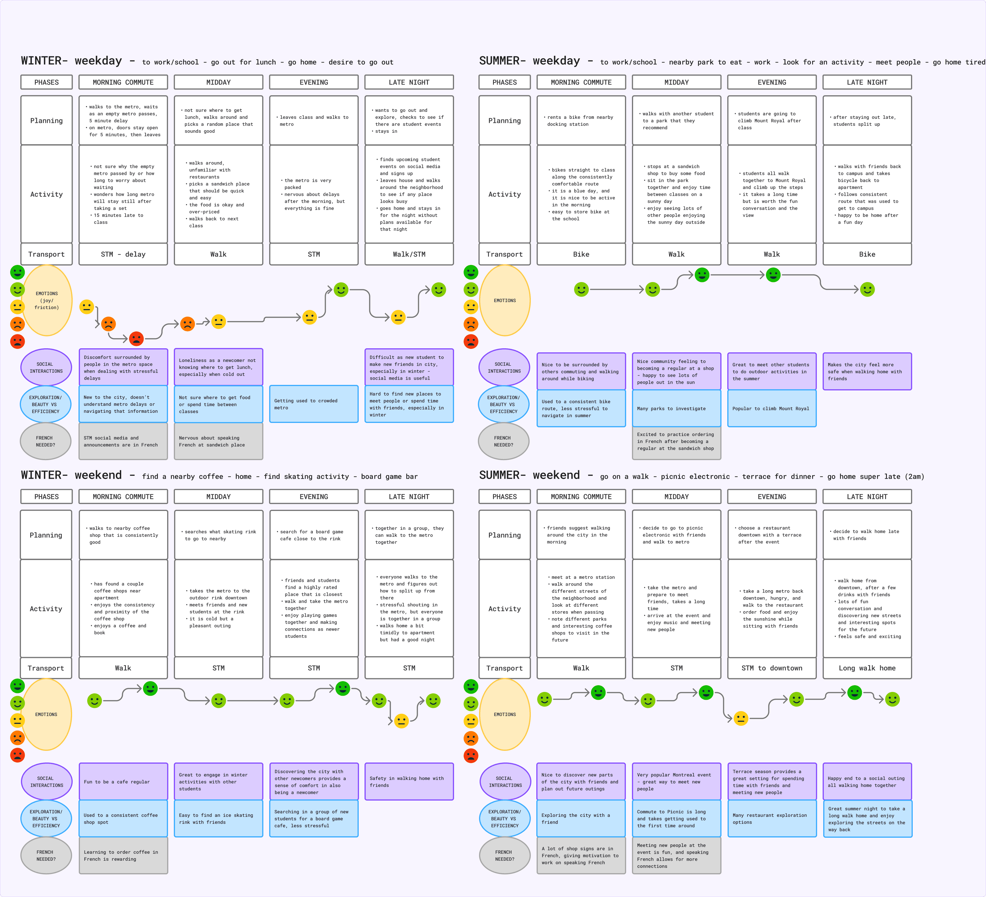
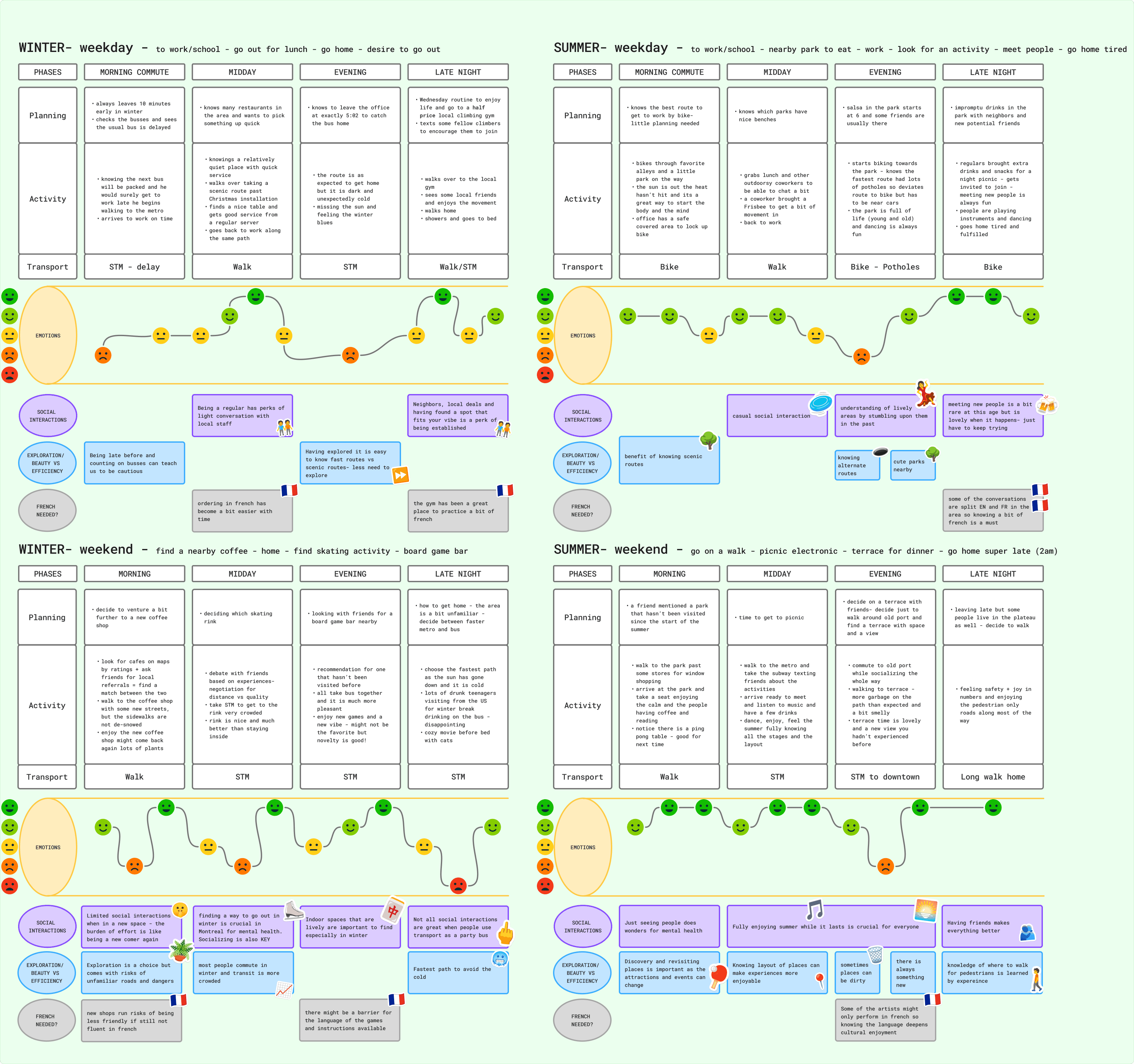
James moves through the city with confidence built over years. On a summer evening he bikes through back alleys he chose deliberately, joins a salsa session in a park where regulars bring snacks for strangers, and ends up in an impromptu gathering with neighbors. His routes are not the fastest ones. They are the ones he has learned are worth taking. But that familiarity has a cost. Discovery has become a conscious decision he weighs against the comfort of what he already loves. A new popup market, a busker he has never seen, a street he has walked past a hundred times without turning down: these things are still there. He just has to choose to look.
t
Journey Map
The journey map brought these two stories together into a single arc. Meriem wants to change up her commute home, exploring nearby neighborhoods even if it makes the walk a little longer. She opens Détour, sees what others say is worth visiting, picks her interests and her vibe, and builds a route. She walks, notices things, stops somewhere new, and shares what she found. Over time those walks add up. Streets she once avoided become familiar. She starts exploring on her own. Eventually she becomes the person leaving notes for the next Meriem who just arrived, and James finally has a place to put everything he has been wanting to share.
Journey Mapping
The journey map brought these two stories together into a single arc. Meriem wants to change up her commute home, exploring nearby neighborhoods even if it makes the walk a little longer. She opens Détour, sees what others say is worth visiting, picks her interests and her vibe, and builds a route. She walks, notices things, stops somewhere new, and shares what she found. Over time those walks add up. Streets she once avoided become familiar. She starts exploring on her own. Eventually she becomes the person leaving notes for the next Meriem who just arrived, and James finally has a place to put everything he has been wanting to share.

03
Personas and Mapping
Personas
Two personas shaped everything that followed: someone who has just arrived and someone who has been here long enough to know what the city hides.
t

Meriem is twenty, a Moroccan-French architecture student new to Montreal. She is curious and visually driven but tends to stick to familiar routes, sometimes cancelling plans because she is not sure a destination will be worth the trip. She wants to feel at home in Montreal. She just needs a way in.
t
James is thirty-five. He moved to Montreal several years ago. He has favorite routes, preferred parks, and a strong sense of the city. He remembers arriving without knowing anyone or anywhere, and has spent years building the kind of familiarity that lets him move through Montreal with confidence. He already recommends places to newcomers informally. Détour gives that knowledge somewhere to go.

As newcomers spend more time in the city, the boundary between these two personas shifts naturally. The platform is designed to support that transition, turning people who once needed guidance into the ones who provide it.
Experience Mapping

James moves through the city with confidence built over years. On a summer evening he bikes through back alleys he chose deliberately, joins a salsa session in a park where regulars bring snacks for strangers, and ends up in an impromptu gathering with neighbors. His routes are not the fastest ones. They are the ones he has learned are worth taking. But that familiarity has a cost. Discovery has become a conscious decision he weighs against the comfort of what he already loves. A new popup market, a busker he has never seen, a street he has walked past a hundred times without turning down: these things are still there. He just has to choose to look.
Meriem follows the fastest path because she has no signal that deviating is worth it. Leaving the direct route has equal odds of finding something beautiful or finding nothing, getting lost, or stumbling into somewhere that does not feel safe. On a winter weekday she waits for a delayed metro without knowing why, picks a random lunch spot because she does not know the neighborhood, and stays in for the evening because she could not find plans in time. On a summer weekend she discovers a ping pong table in a park and files it away for next time. She is building a picture of the city slowly, through trial and error. The problem is that trial and error alone is a slow and sometimes discouraging way to fall in love with somewhere.

t
Journey Map
The journey map brought these two stories together into a single arc. Meriem wants to change up her commute home, exploring nearby neighborhoods even if it makes the walk a little longer. She opens Détour, sees what others say is worth visiting, picks her interests and her vibe, and builds a route. She walks, notices things, stops somewhere new, and shares what she found. Over time those walks add up. Streets she once avoided become familiar. She starts exploring on her own. Eventually she becomes the person leaving notes for the next Meriem who just arrived, and James finally has a place to put everything he has been wanting to share.
03
Personas and Mapping
Personas
Two personas shaped everything that followed: someone who has just arrived and someone who has been here long enough to know what the city hides.
t
Meriem is twenty, a Moroccan-French architecture student new to Montreal. She is curious and visually driven but tends to stick to familiar routes, sometimes cancelling plans because she is not sure a destination will be worth the trip. She wants to feel at home in Montreal. She just needs a way in.
t
James is thirty-five. He moved to Montreal several years ago. He has favorite routes, preferred parks, and a strong sense of the city. He remembers arriving without knowing anyone or anywhere, and has spent years building the kind of familiarity that lets him move through Montreal with confidence. He already recommends places to newcomers informally. Détour gives that knowledge somewhere to go.
Experience Mapping
Meriem follows the fastest path because she has no signal that deviating is worth it. Leaving the direct route has equal odds of finding something beautiful or finding nothing, getting lost, or stumbling into somewhere that does not feel safe. On a winter weekday she waits for a delayed metro without knowing why, picks a random lunch spot because she does not know the neighborhood, and stays in for the evening because she could not find plans in time. On a summer weekend she discovers a ping pong table in a park and files it away for next time. She is building a picture of the city slowly, through trial and error. The problem is that trial and error alone is a slow and sometimes discouraging way to fall in love with somewhere.
t
James moves through the city with confidence built over years. On a summer evening he bikes through back alleys he chose deliberately, joins a salsa session in a park where regulars bring snacks for strangers, and ends up in an impromptu gathering with neighbors. His routes are not the fastest ones. They are the ones he has learned are worth taking. But that familiarity has a cost. Discovery has become a conscious decision he weighs against the comfort of what he already loves. A new popup market, a busker he has never seen, a street he has walked past a hundred times without turning down: these things are still there. He just has to choose to look.
Journey Map
The journey map brought these two stories together into a single arc. Meriem wants to change up her commute home, exploring nearby neighborhoods even if it makes the walk a little longer. She opens Détour, sees what others say is worth visiting, picks her interests and her vibe, and builds a route. She walks, notices things, stops somewhere new, and shares what she found. Over time those walks add up. Streets she once avoided become familiar. She starts exploring on her own. Eventually she becomes the person leaving notes for the next Meriem who just arrived, and James finally has a place to put everything he has been wanting to share.
04
Ideation & Wireframes
Ideation & Wireframes
Early ideation…
started in a different place than where the product ended up. The first direction we explored was danger avoidance: could the platform route people away from unsafe or uncomfortable areas, keeping them on streets that felt more welcoming? It was a reasonable starting point given what the research said about safety and familiarity. But the more we worked with it, the more it felt like the wrong frame. A product built around avoiding bad things puts fear at the center of the experience. That is not what Meriem needs. What she needs is a reason to go somewhere, not a reason to stay away from somewhere else.
The pivot was toward beauty wayfinding.
Instead of routing around the negative, the platform would route toward the positive: populated streets, green spaces, murals, lively squares, and the kinds of places that make a walk feel like it was worth taking. Safety becomes a byproduct rather than the premise. Well-lit, active, visually interesting routes are inherently more welcoming, without the product ever needing to say so.

From that reframe, several directions shaped the exploration of what Détour could be.
t
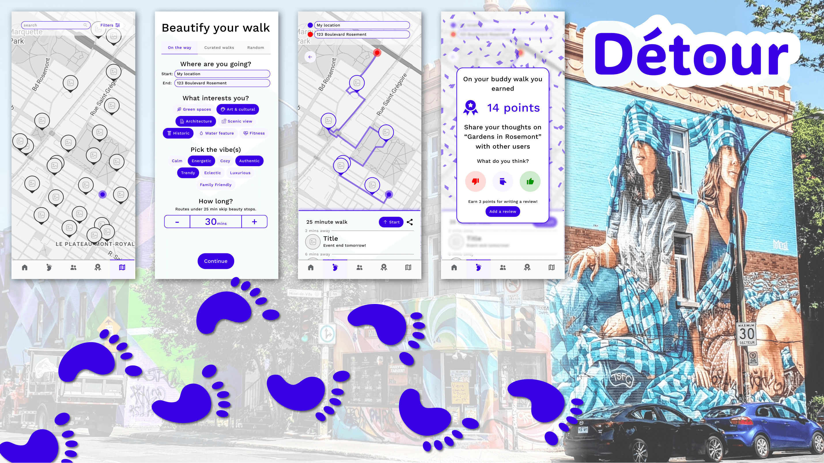
Beautify your walk with minor detours.
Not every exploration needs to be a dedicated outing. A small pitstop on the way to the metro, a two-minute detour past a mural on the way to a friend's place: these moments are low commitment but high reward. The platform could surface them naturally along routes people are already taking, making beauty something that happens on the way rather than something that requires a plan.

t
Neighborhood vibe as a filter, not a category
Newcomers like Meriem often do not know what they are looking for. They know the feeling they want: somewhere lively, somewhere calm, somewhere worth photographing. Filtering by vibe rather than by category respects that. It also matches how resident knowledge sharers actually talk about the city when recommending it to others.

t
Discover where you might want to live
For newcomers still figuring out which neighborhood fits them, the platform could aggregate community stops, vibes, and activity density into an honest picture of what it actually feels like to live somewhere, not just what is nearby on a map but what kind of life a neighborhood makes possible day to day.

t
Live and Spontaneous City Moments
Part of what makes a city feel alive is what is happening right now: a busker, a pop-up market, people dancing in a park on a Saturday afternoon. Surfacing these alongside fixed points of interest would give users a reason to open the app even on a route they had walked before.

t
Curated routes from resident knowledge sharers
The equivalent of a community running route, but built for exploration rather than exercise. Resident knowledge sharers have spent years developing preferred walks that pass through places they genuinely love. Giving them a way to share that tacit knowledge as a complete route, rather than a list of individual stops, was one of the more compelling directions explored.

t
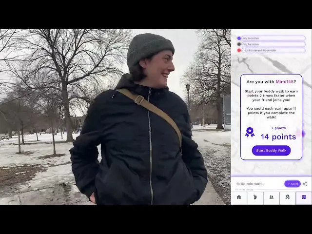
Buddy Walks and Gamification
Social exploration and group discovery. People often explore with other people. A friend joining mid-walk changes the entire experience. Designing for shared exploration, including real-time location sharing between friends on the same route, made the product more honest about how discovery actually happens.
Gamification that rewards both contribution and exploration. Points accumulate individually but grow faster in groups. Walking with a friend, completing a curated route, or rating a stop after visiting could all contribute. The intent was to make contribution feel like a natural extension of using the app, and to make exploring with others feel more rewarding than going alone.

Not all of these directions made it into the first prototype.
Some were set aside as scope narrowed. Others evolved into something simpler. We focused on three directions to test first: beautifying an everyday walk with minor detours, curated routes from resident knowledge sharers, and buddy walks with shared location.
t
05
Feedback & Improvements
Video Prototype
With the core directions established, we built a clickable low-fidelity prototype framed as a single story: Meriem's journey from opening the app for the first time to completing a walk with a friend. Because public user interviews were not permitted at this stage, we shared the prototype with five classmates through structured tasks and semi-structured interviews. We wanted to know whether the feeling of discovering Montreal in a new way came through, and where the experience broke down.
What we found was that the bones were right but the experience was fighting itself at almost every turn.
The city was there. The feeling of freedom was not.
The first flow asked users to set a destination, pick location types, choose a vibe from eight options, and confirm a maximum detour before the app would show her anything. By the time she reached the map she had already made a dozen decisions and the walk had not started yet. When stops were then presented one at a time for a binary accept or reject, participants felt like they were approving a plan rather than exploring a city. 4 of 5 found it disorienting. The promise of discovery had been replaced by a funnel.
We scrapped the funnel entirely. The new version puts the map first. Users see their fastest route as a baseline and add stops directly by tapping the map. The route self-optimizes around whatever they choose and detour time updates in real time. The walk becomes theirs from the first tap.

Was: a sequential funnel of decisions before the map appeared.
Became: a live map where users build their own route by tapping directly.

A map full of pins that told you nothing about the city.
Seven location types and eight vibe labels created more confusion than clarity. Fitness was unwanted. Scenic felt redundant. Labels like luxurious and eclectic meant different things to everyone and gave no useful signal about what a walk would actually feel like.
Asking users what they would actually visit surfaced something missing entirely: urban discovery. Markets, popups, parades, street festivals: the spontaneous fabric of a city that rarely appears on a permanent map but is often the best reason to go outside. Architecture and historic were merged to match how users naturally think about built heritage. Seven types became five. Eight vibe labels became three: Calm, Lively, Busy. The pins now carry both dimensions. Icons and colors distinguish location type accessibly, and the perimeter encodes activity level: plain, wavy, or jagged. A user can scan the map and feel the city before opening a single stop. Toggles let users filter to liked, visited, or friends.

Was: a sequential funnel of decisions before the map appeared.
Became: a live map where users build their own route by tapping directly.

Curated walks were loved. They just needed to feel like an invitation.
When participants reached the curated walks section something shifted. The concept resonated immediately. 5 of 5 supported it. People understood what residents had to offer and wanted access to it. But the early screens presented routes as lists of text, and the stops did not come alive until you were already standing at them. Only 2 of 5 said they might contribute their own routes, a finding likely shaped by an interview pool that skewed heavily toward newcomers, the people who need walks most and are least positioned to write them. That gap is worth revisiting.
The updated walks onboard users with overall rating, and total walk time before anything else. As users scroll through the stops, each one highlights live on the map. The walk becomes a story with a known shape, a visual path, and finally an author you can trace before taking a single step.

Was: text-heavy stop lists with no visual sense of the route.
Became: a visual walkthrough with live map highlighting, author credit, rating, and total time upfront.

Moments were alive. They were just showing up uninvited.
The live moments feature was one of the ideas the team was most excited about: a busker, a pop-up market, something unexpected happening right now. But surfacing them as a popup the moment the app opened felt jarring. Participants wanted to find moments on their own terms, when they were in the mood for something spontaneous, not have them interrupt whatever they came to do.
Moments now live in their own tab. Users browse them when they want to. They can add a moment directly to the map as a destination, combining it with permanent stops into a single route. New moments surface through a notification badge, present but never pushy.

Was: live events as an interruption on app open.
Became: a browsable tab where moments can be added to the map alongside any other stop.

Rating felt like a chore. It needed to feel like a reflection.
The original design asked Meriem to rate each stop the moment she arrived, while she was still taking it in. 3 of 5 participants raised this unprompted. 2 said they would skip it entirely if they could. The rating was not the problem. The timing was.
Rating now happens at the end of the walk, as a single optional moment of reflection. It is always skippable. Over time, averaged ratings feed back into the user profile, quietly helping surface stops that match what each person actually enjoys.

Was: a rating prompt triggered the moment a user arrived at each stop.
Became: a single optional reflection at the end of the walk, always skippable.

Points asked users to perform. They wanted to grow.
The points and badges system went through paper prototypes before anything was built. It showed clearly that competitive framing created the wrong feeling. 4 of 5 participants reacted negatively to social comparison. 1 loved it. But when asked about personal metrics, all 5 said they would find value in tracking their own walks, distances, and preferences over time.
We turned the focus inward. The profile now shows a personal walk recap: history, distances, and how their activity compares to a healthy ideal. Different destination categories are counted separately, surfacing patterns in what each user gravitates toward. Averaged ratings help users understand their own preferences over time, so the more they explore the better the app gets at reflecting who they are and what they enjoy.

Was: a social points system with badges visible to friends, framing exploration as competition.
Became: a personal recap showing walk history, category breakdown, healthy activity benchmarks, and preference patterns surfaced through ratings.

Sharing walks meant knowing where your people are.
The original social feed was designed to surface how friends were doing: their walks, their badges, their activity. It felt like performance rather than connection. 3 of 5 participants said they mostly walk alone. The 2 who valued the social layer wanted one specific thing: to know where a friend was so they could arrive at the same time, or spontaneously invite someone nearby to join them mid-walk.
We let go of the feed entirely and focused on what actually mattered. The chat became a dedicated space for planning walks and sharing routes. Location sharing is opt-in, showing how far away friends are so a nearby friend can be pulled into a walk on a whim. It can be hidden in privacy settings at any time.

Was: a social feed showing points, social badges and location badges.
Became: a planning-focused chat with route sharing and opt-in proximity-based location sharing for spontaneous and coordinated walks.

Contribution needed to feel safe.
Privacy concerns surfaced entirely without prompting. Users wanted to share knowledge with the community but on their own terms. Once they started thinking about it, they could not stop.
Pins, reviews, real-time location, active status, and visited places each have their own visibility controls. Location and status are limited to friends or only me. Everything else can be set to public, friends only, anonymous, or private. Nothing is exposed by default.

Creating a pin: giving local knowledge a home.
Détour only works if people who know the city put knowledge in. Pin creation was designed to be thorough enough to be useful and light enough to feel worth doing. Contributors name the location, set visibility, add photos, categorize the type of place and its vibe, and indicate when people should visit: year-round, within a specific window, or on exact dates. A best time of day can be set and an optional blurb gives visitors a sense of what to expect.
Every pin is created the same way. Moments are not something users create differently, they are something the app recognizes. A quiet park becomes a moment at peak fall color. A street becomes a moment during a festival. Contribution stays simple, while the system ensures the right experiences surface at the right time.

05
Feedback & Improvements
Video Prototype
With the core directions established, we built a clickable low-fidelity prototype framed as a single story: Meriem's journey from opening the app for the first time to completing a walk with a friend. Because public user interviews were not permitted at this stage, we shared the prototype with five classmates through structured tasks and semi-structured interviews. We wanted to know whether the feeling of discovering Montreal in a new way came through, and where the experience broke down.
What we found was that the bones were right but the experience was fighting itself at almost every turn.
The city was there. The feeling of freedom was not.
The first flow asked users to set a destination, pick location types, choose a vibe from eight options, and confirm a maximum detour before the app would show her anything. By the time she reached the map she had already made a dozen decisions and the walk had not started yet. When stops were then presented one at a time for a binary accept or reject, participants felt like they were approving a plan rather than exploring a city. 4 of 5 found it disorienting. The promise of discovery had been replaced by a funnel.
We scrapped the funnel entirely. The new version puts the map first. Users see their fastest route as a baseline and add stops directly by tapping the map. The route self-optimizes around whatever they choose and detour time updates in real time. The walk becomes theirs from the first tap.
Was: a sequential funnel of decisions before the map appeared.
Became: a live map where users build their own route by tapping directly.
Was: a sequential funnel of decisions before the map appeared.
Became: a live map where users build their own route by tapping directly.
A map full of pins that told you nothing about the city.
Seven location types and eight vibe labels created more confusion than clarity. Fitness was unwanted. Scenic felt redundant. Labels like luxurious and eclectic meant different things to everyone and gave no useful signal about what a walk would actually feel like.
Asking users what they would actually visit surfaced something missing entirely: urban discovery. Markets, popups, parades, street festivals: the spontaneous fabric of a city that rarely appears on a permanent map but is often the best reason to go outside. Architecture and historic were merged to match how users naturally think about built heritage. Seven types became five. Eight vibe labels became three: Calm, Lively, Busy. The pins now carry both dimensions. Icons and colors distinguish location type accessibly, and the perimeter encodes activity level: plain, wavy, or jagged. A user can scan the map and feel the city before opening a single stop. Toggles let users filter to liked, visited, or friends.
Was: a sequential funnel of decisions before the map appeared.
Became: a live map where users build their own route by tapping directly.
Was: a sequential funnel of decisions before the map appeared.
Became: a live map where users build their own route by tapping directly.
Curated walks were loved. They just needed to feel like an invitation.
When participants reached the curated walks section something shifted. The concept resonated immediately. 5 of 5 supported it. People understood what residents had to offer and wanted access to it. But the early screens presented routes as lists of text, and the stops did not come alive until you were already standing at them. Only 2 of 5 said they might contribute their own routes, a finding likely shaped by an interview pool that skewed heavily toward newcomers, the people who need walks most and are least positioned to write them. That gap is worth revisiting.
The updated walks onboard users with overall rating, and total walk time before anything else. As users scroll through the stops, each one highlights live on the map. The walk becomes a story with a known shape, a visual path, and finally an author you can trace before taking a single step.
Was: text-heavy stop lists with no visual sense of the route.
Became: a visual walkthrough with live map highlighting, author credit, rating, and total time upfront.
Was: a sequential funnel of decisions before the map appeared.
Became: a live map where users build their own route by tapping directly.
Moments were alive. They were just showing up uninvited.
The live moments feature was one of the ideas the team was most excited about: a busker, a pop-up market, something unexpected happening right now. But surfacing them as a popup the moment the app opened felt jarring. Participants wanted to find moments on their own terms, when they were in the mood for something spontaneous, not have them interrupt whatever they came to do.
Moments now live in their own tab. Users browse them when they want to. They can add a moment directly to the map as a destination, combining it with permanent stops into a single route. New moments surface through a notification badge, present but never pushy.
Was: live events as an interruption on app open.
Became: a browsable tab where moments can be added to the map alongside any other stop.
Was: a sequential funnel of decisions before the map appeared.
Became: a live map where users build their own route by tapping directly.
Rating felt like a chore. It needed to feel like a reflection.
The original design asked Meriem to rate each stop the moment she arrived, while she was still taking it in. 3 of 5 participants raised this unprompted. 2 said they would skip it entirely if they could. The rating was not the problem. The timing was.
Rating now happens at the end of the walk, as a single optional moment of reflection. It is always skippable. Over time, averaged ratings feed back into the user profile, quietly helping surface stops that match what each person actually enjoys.
Was: a rating prompt triggered the moment a user arrived at each stop.
Became: a single optional reflection at the end of the walk, always skippable.
Was: a sequential funnel of decisions before the map appeared.
Became: a live map where users build their own route by tapping directly.
Points asked users to perform. They wanted to grow.
The points and badges system went through paper prototypes before anything was built. It showed clearly that competitive framing created the wrong feeling. 4 of 5 participants reacted negatively to social comparison. 1 loved it. But when asked about personal metrics, all 5 said they would find value in tracking their own walks, distances, and preferences over time.
We turned the focus inward. The profile now shows a personal walk recap: history, distances, and how their activity compares to a healthy ideal. Different destination categories are counted separately, surfacing patterns in what each user gravitates toward. Averaged ratings help users understand their own preferences over time, so the more they explore the better the app gets at reflecting who they are and what they enjoy.
Was: a social points system with badges visible to friends, framing exploration as competition.
Became: a personal recap showing walk history, category breakdown, healthy activity benchmarks, and preference patterns surfaced through ratings.
Was: a sequential funnel of decisions before the map appeared.
Became: a live map where users build their own route by tapping directly.
Sharing walks meant knowing where your people are.
The original social feed was designed to surface how friends were doing: their walks, their badges, their activity. It felt like performance rather than connection. 3 of 5 participants said they mostly walk alone. The 2 who valued the social layer wanted one specific thing: to know where a friend was so they could arrive at the same time, or spontaneously invite someone nearby to join them mid-walk.
We let go of the feed entirely and focused on what actually mattered. The chat became a dedicated space for planning walks and sharing routes. Location sharing is opt-in, showing how far away friends are so a nearby friend can be pulled into a walk on a whim. It can be hidden in privacy settings at any time.
Was: a social feed showing points, social badges and location badges.
Became: a planning-focused chat with route sharing and opt-in proximity-based location sharing for spontaneous and coordinated walks.
Was: a sequential funnel of decisions before the map appeared.
Became: a live map where users build their own route by tapping directly.
Contribution needed to feel safe.
Privacy concerns surfaced entirely without prompting. Users wanted to share knowledge with the community but on their own terms. Once they started thinking about it, they could not stop.
Pins, reviews, real-time location, active status, and visited places each have their own visibility controls. Location and status are limited to friends or only me. Everything else can be set to public, friends only, anonymous, or private. Nothing is exposed by default.
Creating a pin: giving local knowledge a home.
Détour only works if people who know the city put knowledge in. Pin creation was designed to be thorough enough to be useful and light enough to feel worth doing. Contributors name the location, set visibility, add photos, categorize the type of place and its vibe, and indicate when people should visit: year-round, within a specific window, or on exact dates. A best time of day can be set and an optional blurb gives visitors a sense of what to expect.
Every pin is created the same way. Moments are not something users create differently, they are something the app recognizes. A quiet park becomes a moment at peak fall color. A street becomes a moment during a festival. Contribution stays simple, while the system ensures the right experiences surface at the right time.
Creating a pin: giving local knowledge a home.
Détour only works if people who know the city put knowledge in. Pin creation was designed to be thorough enough to be useful and light enough to feel worth doing. Contributors name the location, set visibility, add photos, categorize the type of place and its vibe, and indicate when people should visit: year-round, within a specific window, or on exact dates. A best time of day can be set and an optional blurb gives visitors a sense of what to expect.
Every pin is created the same way. What makes a moment different is not how it is made but when it surfaces. The app recognizes time-sensitive pins and elevates them when they become urgent: the last days of fall color, a three-day street festival, fireworks that only happen once. These are not missed because users did not know. They are missed because nobody told them in time. Moments fix that.
06
Final Experience
The core experience
A walk starts with a route and evolves through discovery. Stops are added directly from the map, guided by clear signals of what each place offers, while the route adapts in real time.
The final product puts the map at the center of exploration.
Users start with a route, shape it through discovery, and move through the city with a growing sense of confidence rather than instruction.
A short onboarding introduces how to read the map. Each pin encodes two signals at a glance: what a place is and what it feels like. Icons represent location type, while the shape of the pin reflects activity level, from calm to lively to busy. This removes the need to search or interpret labels. Users can scan and decide instantly what is worth their time.
From there, the experience begins directly on the map. Users can filter, adjust their starting point, or set a destination, but they do not need to plan ahead. A walk is built by tapping pins and adding stops along the way. Each addition updates the route automatically, keeping it efficient without taking control away from the user.
When ready, users begin navigation and move through each stop in sequence. The experience stays lightweight and uninterrupted, allowing the city itself to remain the focus. At the end of the walk, users can reflect by rating places and optionally adding photos or notes. This step is always skippable, respecting the moment rather than interrupting it.

Building a Walk
A walk starts with a route and evolves through discovery. Stops are added directly from the map, guided by clear signals of what each place offers, while the route adapts in real time.
Extending the experience
Beyond the core flow, three features expand how users explore:

Moments
Time-sensitive experiences that are highly rated and may be ending soon. These are often events or lively gatherings that act as strong destinations. Users can browse what is happening nearby and add moments directly to their route.

Walks
Multi-stop routes created by other users. These provide a more guided way to explore, offering structured paths built from local knowledge while remaining fully interactive on the map.

Personal Profile
A reflection of past activity rather than performance. Users can view their history over time, including distance, time, pace, and visit patterns across location types. Preference signals, based on past ratings, help surface what they are most likely to enjoy, reinforcing a more personalized exploration over time.
06
Final Experience
The core experience
A walk starts with a route and evolves through discovery. Stops are added directly from the map, guided by clear signals of what each place offers, while the route adapts in real time.
The final product puts the map at the center of exploration.
Users start with a route, shape it through discovery, and move through the city with a growing sense of confidence rather than instruction.
A short onboarding introduces how to read the map. Each pin encodes two signals at a glance: what a place is and what it feels like. Icons represent location type, while the shape of the pin reflects activity level, from calm to lively to busy. This removes the need to search or interpret labels. Users can scan and decide instantly what is worth their time.
From there, the experience begins directly on the map. Users can filter, adjust their starting point, or set a destination, but they do not need to plan ahead. A walk is built by tapping pins and adding stops along the way. Each addition updates the route automatically, keeping it efficient without taking control away from the user.
When ready, users begin navigation and move through each stop in sequence. The experience stays lightweight and uninterrupted, allowing the city itself to remain the focus. At the end of the walk, users can reflect by rating places and optionally adding photos or notes. This step is always skippable, respecting the moment rather than interrupting it.
Building a Walk
A walk starts with a route and evolves through discovery. Stops are added directly from the map, guided by clear signals of what each place offers, while the route adapts in real time.
Extending the experience
Beyond the core flow, three features expand how users explore:
Moments
Time-sensitive experiences that are highly rated and may be ending soon. These are often events or lively gatherings that act as strong destinations. Users can browse what is happening nearby and add moments directly to their route.
Walks
Multi-stop routes created by other users. These provide a more guided way to explore, offering structured paths built from local knowledge while remaining fully interactive on the map.
Personal Profile
A reflection of past activity rather than performance. Users can view their history over time, including distance, time, pace, and visit patterns across location types. Preference signals, based on past ratings, help surface what they are most likely to enjoy, reinforcing a more personalized exploration over time.
07
Reflections
The most important design decision was a reframe, not a feature.
The project started as a “Waze for walking” with safety cues and optimized routes. What we uncovered is that pedestrian risk does not function the same way as driving risk, especially in a city like Montreal. Over-indexing on danger does not make people explore more, it can discourage them from going out at all.
What people actually need is confidence. Confidence comes from experience, and experience comes from going outside and engaging with the city. Shifting from danger avoidance to beauty wayfinding reframed the product from something reactive to something generative. It no longer helps users avoid the city, it gives them reasons to enter it. That shift defined every decision that followed.
Designing for the contributor determines whether the product exists at all.
Exploration is only as good as what is surfaced. Without contributors, there is no product. While our interviews skewed toward newcomers who were less likely to contribute, secondary research showed a strong existing behavior: people already share local knowledge at scale through blogs, Reddit, and video. The challenge is not willingness, it is creating the right conditions. Contribution has to feel safe, lightweight, and worthwhile. If it feels risky or effortful, the platform collapses into empty or low-quality content
Secondary research surfaced emotional realities that structured methods often flatten.
Working with Reddit threads, blogs, and community content revealed patterns that are difficult to extract in formal interviews. Newcomers are not just looking for things to do, they are trying to avoid isolation, especially in winter. In a city like Montreal, finding reasons to go outside is directly tied to mental well-being.
Existing discovery tools are fragmented and transactional. City websites, event platforms, and directories require users to already know what they are looking for. For someone new, this creates friction and uncertainty. Seeing places validated by locals, with visible signals of quality, creates a different kind of confidence than promotional content ever could.

Local knowledge lives in informal networks, not platforms
Across every source we analyzed, the same pattern appeared. Montreal is widely described as vibrant, welcoming, and full of hidden character. Walking and cycling are consistently named as the best ways to experience it. And yet the places worth finding are almost always discovered through personal recommendations from friends or long-time residents. For newcomers without those connections, that knowledge simply does not transfer. The city stays opaque longer than it needs to.
Familiarity is a design problem, not just a user state.
While the project began with newcomers, the same patterns apply to long-term residents in a different form. Over time, people stop seeing their city. Familiarity reduces attention, and with it, curiosity. Designing for exploration rather than orientation expands the audience and makes the product more honest. The goal is not just to help people navigate a place, but to help them notice it again.
Scope is a design decision, not a constraint.
Letting go of “beautify the walk” and a fully developed gamification system was difficult, especially after investing heavily in both directions. But both introduced complexity without strengthening the core experience. “Beautify the walk” risked empty or irrelevant results, while gamification shifted the focus toward performance rather than exploration.
Testing these ideas early through paper prototypes made it possible to discard them before investing in high-fidelity work. A smaller, coherent system built around map-based exploration ultimately proved stronger than a broader but fragmented feature set.
Reflections
The most important design decision was a reframe, not a feature.
The project started as a “Waze for walking” with safety cues and optimized routes. What we uncovered is that pedestrian risk does not function the same way as driving risk, especially in a city like Montreal. Over-indexing on danger does not make people explore more, it can discourage them from going out at all.
What people actually need is confidence. Confidence comes from experience, and experience comes from going outside and engaging with the city. Shifting from danger avoidance to beauty wayfinding reframed the product from something reactive to something generative. It no longer helps users avoid the city, it gives them reasons to enter it. That shift defined every decision that followed.
Designing for the contributor determines whether the product exists at all.
Exploration is only as good as what is surfaced. Without contributors, there is no product. While our interviews skewed toward newcomers who were less likely to contribute, secondary research showed a strong existing behavior: people already share local knowledge at scale through blogs, Reddit, and video. The challenge is not willingness, it is creating the right conditions. Contribution has to feel safe, lightweight, and worthwhile. If it feels risky or effortful, the platform collapses into empty or low-quality content
Secondary research surfaced emotional realities that structured methods often flatten.
Working with Reddit threads, blogs, and community content revealed patterns that are difficult to extract in formal interviews. Newcomers are not just looking for things to do, they are trying to avoid isolation, especially in winter. In a city like Montreal, finding reasons to go outside is directly tied to mental well-being.
Existing discovery tools are fragmented and transactional. City websites, event platforms, and directories require users to already know what they are looking for. For someone new, this creates friction and uncertainty. Seeing places validated by locals, with visible signals of quality, creates a different kind of confidence than promotional content ever could.
Familiarity is a design problem, not just a user state.
While the project began with newcomers, the same patterns apply to long-term residents in a different form. Over time, people stop seeing their city. Familiarity reduces attention, and with it, curiosity. Designing for exploration rather than orientation expands the audience and makes the product more honest. The goal is not just to help people navigate a place, but to help them notice it again.
Scope is a design decision, not a constraint.
Letting go of “beautify the walk” and a fully developed gamification system was difficult, especially after investing heavily in both directions. But both introduced complexity without strengthening the core experience. “Beautify the walk” risked empty or irrelevant results, while gamification shifted the focus toward performance rather than exploration.
Testing these ideas early through paper prototypes made it possible to discard them before investing in high-fidelity work. A smaller, coherent system built around map-based exploration ultimately proved stronger than a broader but fragmented feature set.
08
My Contributions & Lessons
I led the research synthesis and design direction for the project. I structured how the team approached competitive analysis, created a shared framework for evaluating products, and consolidated findings across academic sources, community content, and peer research into a set of insights that directly informed our design decisions. I also developed the personas, translating broad patterns into specific, usable archetypes to guide the work.
On the design side, I was responsible for all Figma prototypes (low, medium and high). The team worked collaboratively through sketches and discussion, and I translated those ideas into interactive flows, iterating continuously based on feedback. This made prototyping a central tool for alignment, not just a final deliverable.
One of my most important contributions was pushing the pivot from danger avoidance to beauty wayfinding. The original framing was solving for the wrong emotional space. It positioned the product around caution rather than curiosity. Shifting that direction required articulating not just what we were building, but why it should exist in the first place. That moment reinforced that defining the problem is often more impactful than refining the solution.
If I were to approach this project again, I would introduce user interviews and low-fidelity wireframes earlier in the process. Some ideas, particularly around route generation and gamification, could have been challenged much sooner through quick interaction testing. I learned that sketches are useful for exploration, but wireframes are what expose friction. Fidelity is not about polish, it is about learning fast enough to make better decisions.
This project also shifted how I think about design more broadly. Good UX is not just about usability or efficiency, it is about shaping how a product makes someone feel about their environment. In this case, the goal was not just to help people move through a city, but to help them feel more at home in it. That distinction is what made the work meaningful, and it is something I will carry into future projects.
.say hello
I'm open for freelance projects, feel free to email me to see how can we collaborate
.say hello
I'm open for freelance projects, feel free to email me to see how can we collaborate
.say hello
I'm open for freelance projects, feel free to email me to see how can we collaborate
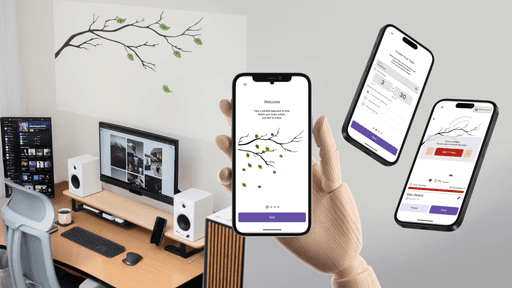

Became: a visual walkthrough with live map highlighting, author credit, rating, and total time upfront.
02
Research & Discovery
After observing some key issues with newcomers as students in Montreal, we built our understanding from secondary research and lived experience: academic literature on urban design and safety, government reports on youth well-being, YouTube videos of Montrealers discussing life in the city, Reddit threads where newcomers ask for advice, and blogs documenting the experience of arriving somewhere new for the first time.
About the users
Urban design shapes whether people feel safe enough to explore
Research shows that feelings of safety in cities are influenced less by actual crime rates than by how familiar and legible a space feels. Poorly lit streets, unfamiliar intersections, and areas without visible foot traffic create hesitation, especially at night, and especially for people who have not yet built a mental map of their surroundings. Environments that are active, well maintained, and visually interesting do the opposite. They invite people to slow down, linger, and venture further. For newcomers especially, discovering these kinds of spaces can support social integration and reduce the isolation that often comes with arriving somewhere new.
Young adults arriving without social networks are at risk of missing the city entirely
Montreal attracts a large number of international students and immigrants each year. Research on youth well-being consistently shows that access to recreational spaces, cultural activities, and community environments supports mental health and helps people build a sense of belonging in a new place. But finding those spaces, and feeling confident enough to go, depends on a familiarity that newcomers do not yet have. Without it, even a free afternoon can feel directionless.
Local knowledge lives in informal networks, not platforms
Across every source we analyzed, the same pattern appeared. Montreal is widely described as vibrant, welcoming, and full of hidden character. Walking and cycling are consistently named as the best ways to experience it. And yet the places worth finding are almost always discovered through personal recommendations from friends or long-time residents. For newcomers without those connections, that knowledge simply does not transfer. The city stays opaque longer than it needs to.
Competitive analysis
Where existing tools fall short
We mapped existing tools across three categories: route and activity tracking, safety and reporting, and local discovery. Each category revealed something useful and each revealed the same fundamental gap. The tools that help you get somewhere do not help you discover anything along the way. The tools that surface local knowledge do not connect to navigation. And the tools built around safety tend to make the city feel more threatening rather than more inviting. No single product addressed all three, and none of them were designed for someone who simply wants to wander with confidence.

Route and activity tracking apps
Route and activity tracking apps like Strava, AllTrails, MapMyRun, and Go Jauntly offer route visualization, distance tracking, and looped paths with estimated completion times. But these apps are built for performance. The routes are optimized for exercise, not for the experience of moving through a neighborhood. Cultural landmarks, public art, and the texture of a neighborhood are outside their scope entirely.
Safety and Reporting
The safety and reporting category was more nuanced than we expected.
SafeTTC allows users to report incidents but does not surface that information back to the community.
Citizen shares incident reports actively but the interface is built entirely around threat, making the city feel more dangerous rather than more navigable.
Waze handles this more thoughtfully, filtering hazards so only those relevant to your current route appear.
Uber's approach to personal safety was the most instructive: allowing users to share their live location or audio record a trip works with the user's confidence rather than against it.
Local discovery platforms
Local discovery platforms were the category closest to what we were trying to build.
Google Maps is the most efficient navigation tool available but is heavily business-focused and designed for getting somewhere, not wandering.
Spotted by Locals offers genuine community curation but sits behind a paid subscription, creating a barrier for students and newcomers most likely to benefit.
Street Art Cities maps only murals. Similar niche platforms exist for other categories, each taking you to one destination at a time before handing you off to Google Maps to actually get there.
Discovery and navigation never meet. That friction is just high enough to make spontaneous exploration impractical.
Exploration and access to public spaces support mental well-being. For newcomers especially, discovering green spaces, cultural venues, and active streets is one of the fastest paths to feeling at home in a new city.
Key Insights
To keep in mind going forward…
Feelings of safety are shaped by familiarity, not just by actual risk. Active, well-lit, visually interesting environments invite people further. Unfamiliar spaces create hesitation that no notification or alert can resolve.
Young adults arriving without social networks are at risk of missing the city entirely. Without existing connections to draw on, discovering what Montreal has to offer takes far longer than it should, and isolation sets in quickly.
Local knowledge lives in informal networks and does not transfer on its own. What long-time residents know about the city stays invisible to newcomers unless there is a platform designed to move it.
No existing tool bridges navigation and discovery. Every product in the competitive landscape chose one or the other, and moving between them creates just enough friction to make spontaneous exploration impractical.
04
Ideation & Wireframes
Early ideation…
started in a different place than where the product ended up. The first direction we explored was danger avoidance: could the platform route people away from unsafe or uncomfortable areas, keeping them on streets that felt more welcoming? It was a reasonable starting point given what the research said about safety and familiarity. But the more we worked with it, the more it felt like the wrong frame. A product built around avoiding bad things puts fear at the center of the experience. That is not what Meriem needs. What she needs is a reason to go somewhere, not a reason to stay away from somewhere else.
The pivot was toward beauty wayfinding.
Instead of routing around the negative, the platform would route toward the positive: populated streets, green spaces, murals, lively squares, and the kinds of places that make a walk feel like it was worth taking. Safety becomes a byproduct rather than the premise. Well-lit, active, visually interesting routes are inherently more welcoming, without the product ever needing to say so.
From that reframe, several directions shaped the exploration of what Détour could be.
t
Beautify your walk with minor detours.
Not every exploration needs to be a dedicated outing. A small pitstop on the way to the metro, a two-minute detour past a mural on the way to a friend's place: these moments are low commitment but high reward. The platform could surface them naturally along routes people are already taking, making beauty something that happens on the way rather than something that requires a plan.
t
Neighborhood vibe as a filter, not a category
Newcomers like Meriem often do not know what they are looking for. They know the feeling they want: somewhere lively, somewhere calm, somewhere worth photographing. Filtering by vibe rather than by category respects that. It also matches how resident knowledge sharers actually talk about the city when recommending it to others.
t
Discover where you might want to live
For newcomers still figuring out which neighborhood fits them, the platform could aggregate community stops, vibes, and activity density into an honest picture of what it actually feels like to live somewhere, not just what is nearby on a map but what kind of life a neighborhood makes possible day to day.
t
Live and Spontaneous City Moments
Part of what makes a city feel alive is what is happening right now: a busker, a pop-up market, people dancing in a park on a Saturday afternoon. Surfacing these alongside fixed points of interest would give users a reason to open the app even on a route they had walked before.
t
Curated routes from resident knowledge sharers
The equivalent of a community running route, but built for exploration rather than exercise. Resident knowledge sharers have spent years developing preferred walks that pass through places they genuinely love. Giving them a way to share that tacit knowledge as a complete route, rather than a list of individual stops, was one of the more compelling directions explored.
t
Buddy Walks and Gamification
Social exploration and group discovery. People often explore with other people. A friend joining mid-walk changes the entire experience. Designing for shared exploration, including real-time location sharing between friends on the same route, made the product more honest about how discovery actually happens.
Gamification that rewards both contribution and exploration. Points accumulate individually but grow faster in groups. Walking with a friend, completing a curated route, or rating a stop after visiting could all contribute. The intent was to make contribution feel like a natural extension of using the app, and to make exploring with others feel more rewarding than going alone.
t
Not all of these directions made it into the first prototype.
Some were set aside as scope narrowed. Others evolved into something simpler. We focused on three directions to test first: beautifying an everyday walk with minor detours, curated routes from resident knowledge sharers, and buddy walks with shared location.
06
Final Experience
The core experience
A walk starts with a route and evolves through discovery. Stops are added directly from the map, guided by clear signals of what each place offers, while the route adapts in real time.
The final product puts the map at the center of exploration.
Users start with a route, shape it through discovery, and move through the city with a growing sense of confidence rather than instruction.
A short onboarding introduces how to read the map. Each pin encodes two signals at a glance: what a place is and what it feels like. Icons represent location type, while the shape of the pin reflects activity level, from calm to lively to busy. This removes the need to search or interpret labels. Users can scan and decide instantly what is worth their time.
From there, the experience begins directly on the map. Users can filter, adjust their starting point, or set a destination, but they do not need to plan ahead. A walk is built by tapping pins and adding stops along the way. Each addition updates the route automatically, keeping it efficient without taking control away from the user.
When ready, users begin navigation and move through each stop in sequence. The experience stays lightweight and uninterrupted, allowing the city itself to remain the focus. At the end of the walk, users can reflect by rating places and optionally adding photos or notes. This step is always skippable, respecting the moment rather than interrupting it.
Building a Walk
A walk starts with a route and evolves through discovery. Stops are added directly from the map, guided by clear signals of what each place offers, while the route adapts in real time.
Extending the experience
Beyond the core flow, three features expand how users explore:
Moments
Time-sensitive experiences that are highly rated and may be ending soon. These are often events or lively gatherings that act as strong destinations. Users can browse what is happening nearby and add moments directly to their route.
Walks
Multi-stop routes created by other users. These provide a more guided way to explore, offering structured paths built from local knowledge while remaining fully interactive on the map.
Personal Profile
A reflection of past activity rather than performance. Users can view their history over time, including distance, time, pace, and visit patterns across location types. Preference signals, based on past ratings, help surface what they are most likely to enjoy, reinforcing a more personalized exploration over time.

